/Lawcode%20Logo%20(White).svg)
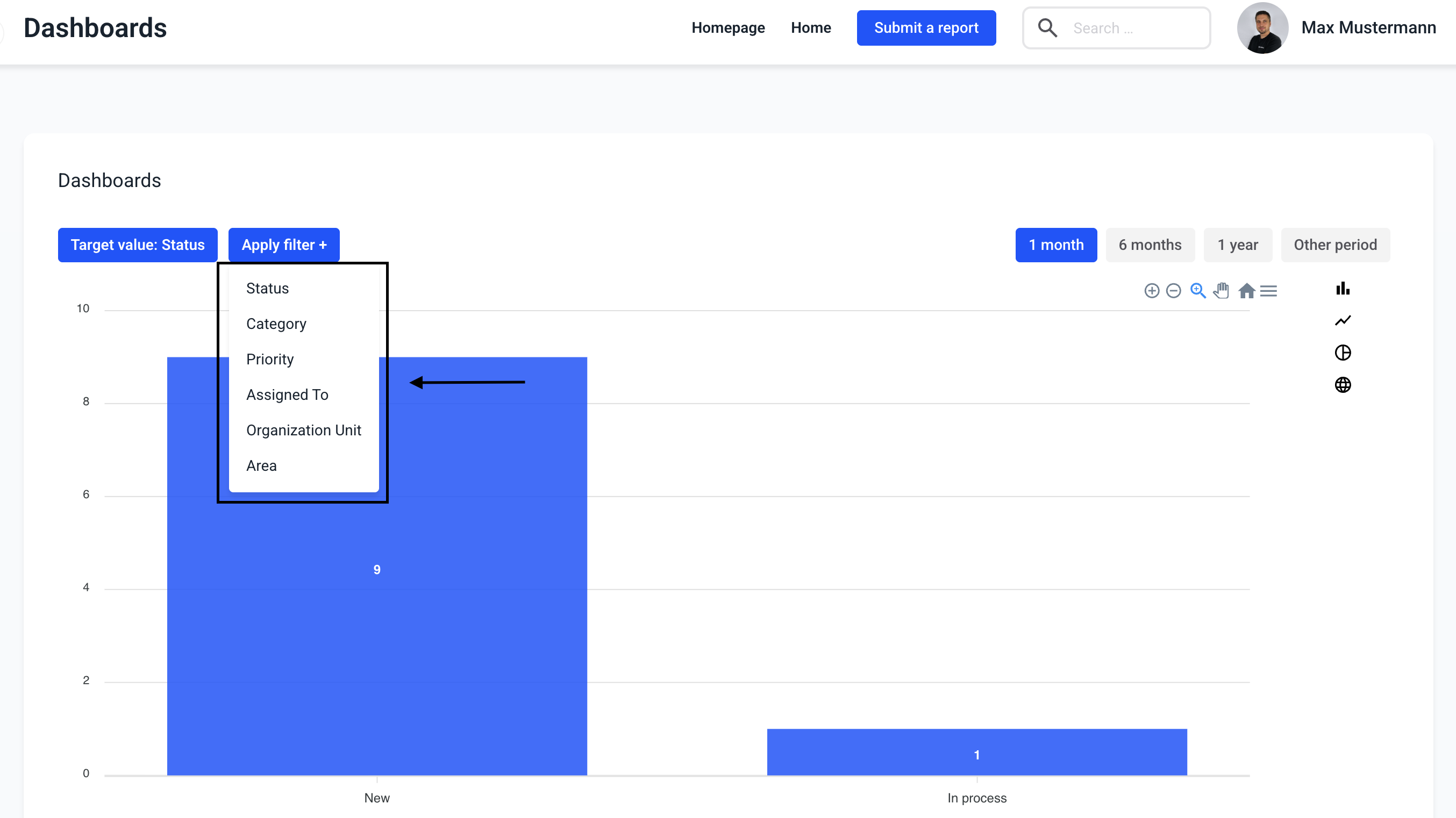
Click on Dashboards.
In the filter there is a possibility to filter by status, category, priority, assigned to, organization unit and area. Click on Apply filter to select it.

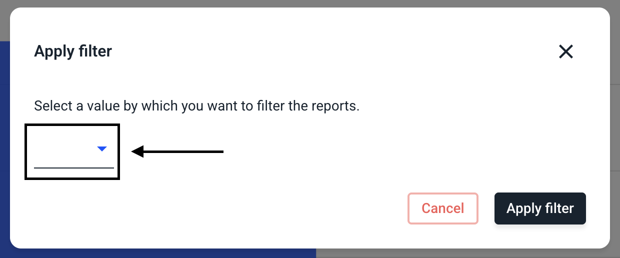
A selection opens. A filter can be selected here.
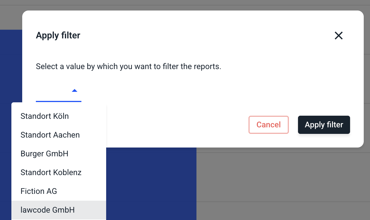
When a filter is selected, it is necessary to choose a value to filter. By clicking on the selection field opens the list of all possibilities of the filter.
Click on the value of the filter to select it.
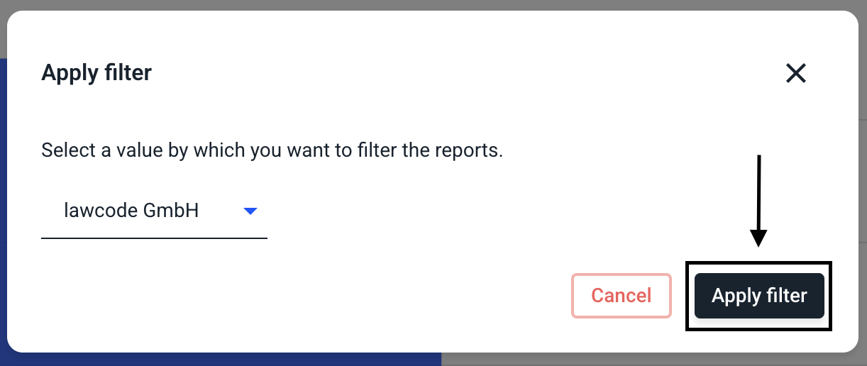
Click Apply Filter to select and apply this filter.
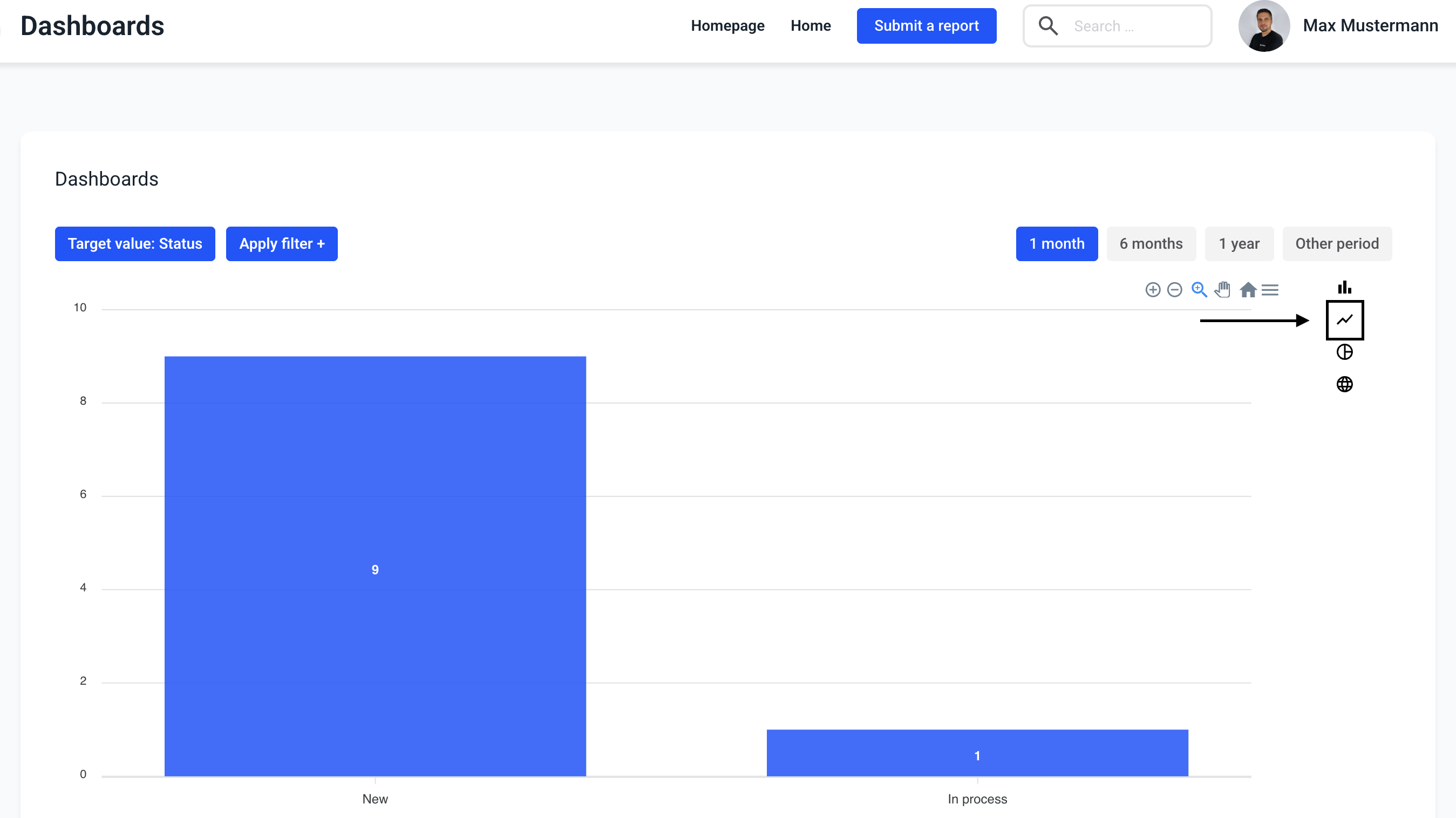
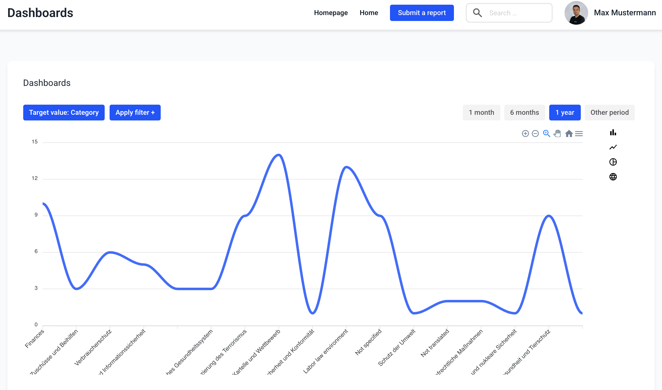
Line chart
There is also the possibility to select a line chart instead of a bar chart. By clicking on the icon, the target value will be displayed as a line chart.
With the target value category, the line graph looks like this.
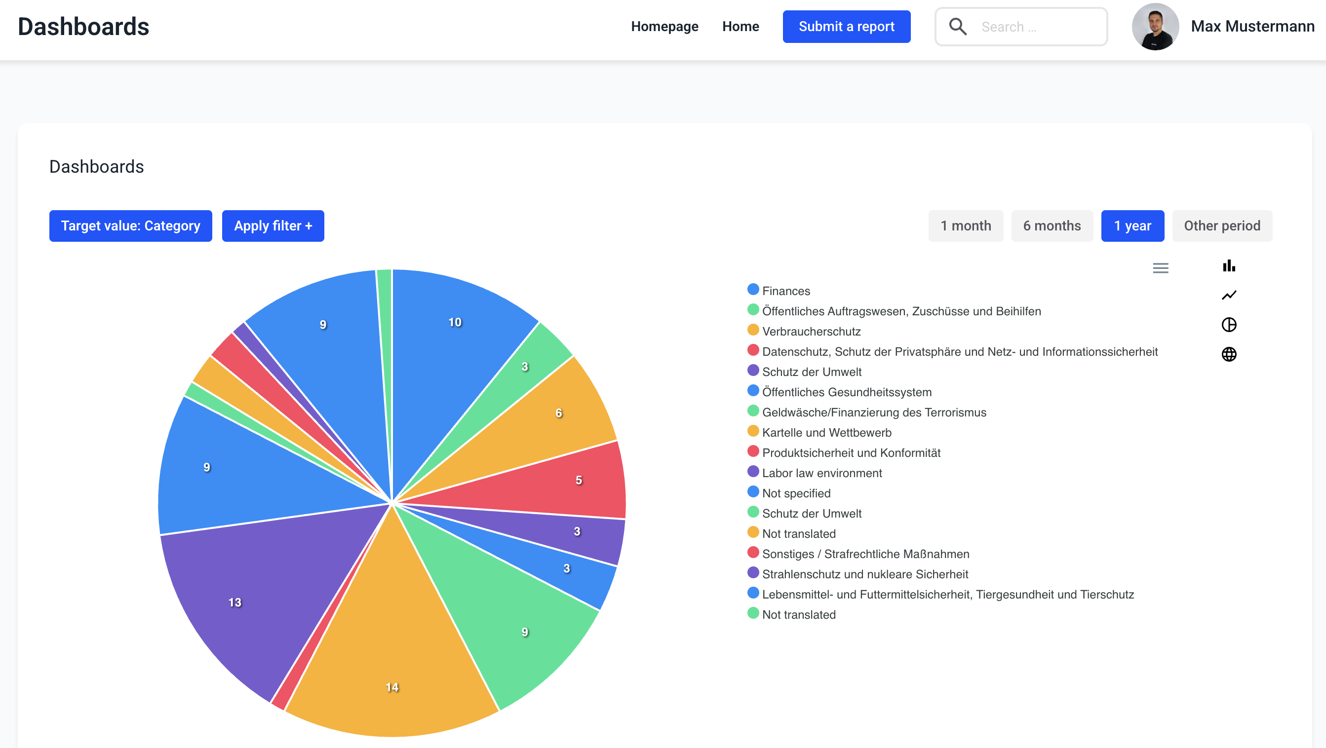
Pie chart
There is also the possibility to select a pie chart instead of a bar chart. By clicking on the icon, the target value is displayed as a pie chart.
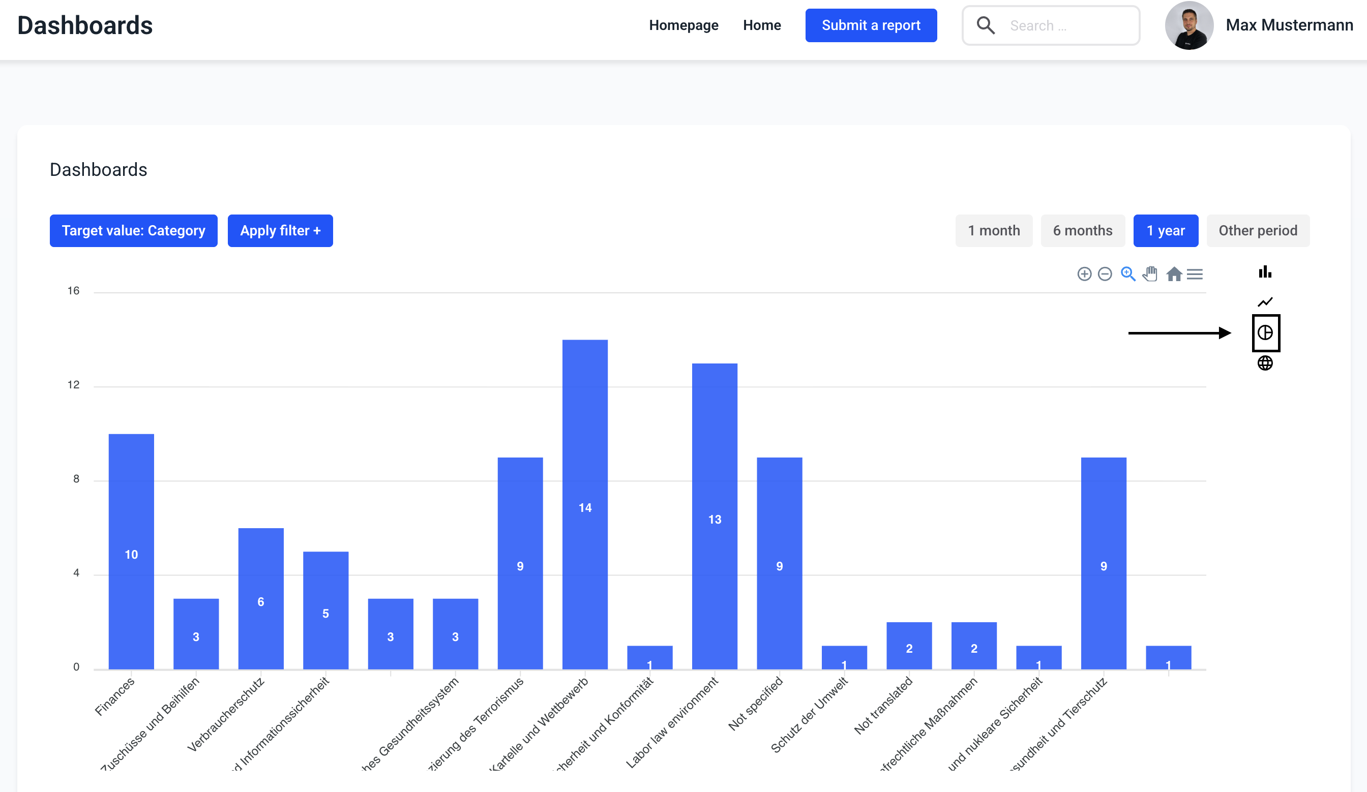
With the target value category, the pie chart looks like this.
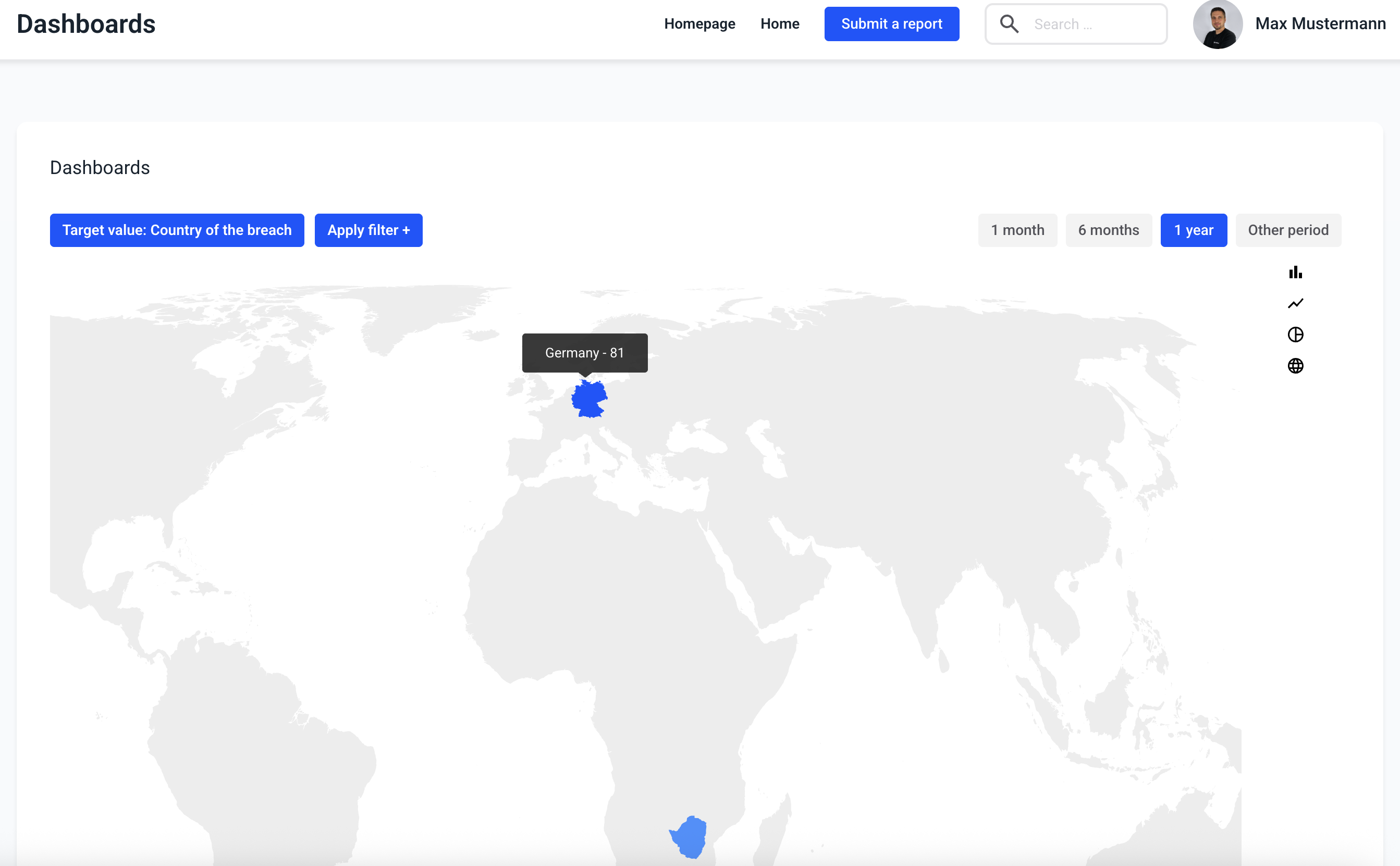
World map
There is also a possibility to display the countries of the clients for which reports have been received on a map. Clicking on the globe icon opens the world map.
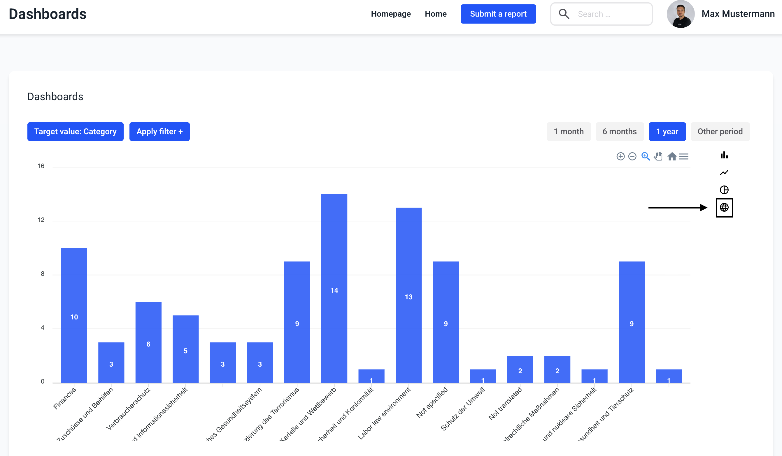
In the world map, the number of cases per country is displayed and colored darker blue as the number increases.